Skip to the content
gcdesigns.im
all your design needs in one location
  • About
  • Portfolio
  • Services
  • Testimonials
  • Blog
  • Contact
  • About
  • Portfolio
  • Services
  • Testimonials
  • Blog
  • Contact

Tag: logo

Categories
Design Uncategorized

16 Famous Designers Show Us Their Favorite Notebooks

  • Post author By admin
  • Post date August 25, 2016

16 Famous Designers Show Us Their Favorite Notebooks
Designers from Ikea, Pentagram, Ideo, and more tell us what makes a great notebook.
Sure, digital design apps might be finally coming into their own, but there’s still nothing better than pen and paper.

It turns out they didn’t. Across multiple disciplines, almost every designer we asked was thrilled to tell us about their notebook of choice and give us a look at how they use it. Our operating assumption going in was that most designers would probably be pretty picky about their notebooks, but this turned out not to be true: While Muji and Moleskine notebooks were the common favorites, some even preferred loose paper.

But what makes the notebooks of designers special isn’t so much what notebook they use, as how they use them. Below, enjoy a peek inside the working notebooks of some of the most prolific designers today—as well as their thoughts on what makes a great one.

GADI AMIT: PRESIDENT AND PRINCIPAL DESIGNER, NEWDEALDESIGN

gadi amit

“[My favorite notebook] is plain, simple tracing paper, (Bienfang’s Parchment 100), and a medium-width felt-tip pen, such as Flair’s PaperMate. Yet I am not picky. Anything goes, ballpoint, pencil, and more.

“It’s just a quick (and dirty!) way of getting to the core of ideas quickly and moving forward.”

MICHAEL BIERUT: PARTNER, PENTAGRAM

michael bierut

“Since 1982, I’ve been using slightly different versions of the same 7-1/2 by 9-3/4-inch school composition book. I save all of them and am now on number 110. I never go anywhere without my notebook. They are so important to me that the first chapter in my new book is dedicated to them, and I reproduce nine spreads from them at actual size. At my recent retrospective at the School of Visual Arts Gallery, an entire room was dedicated to them.

“I like them because they are inexpensive, easy to find, and anything but precious. I could never use a leather-bound notebook. This page is about 20 years old and shows sketches for a logo for my brother Donald’s business.”

JOE BROWN: DESIGNER, IDEO

joe brown

“I use the Muji thread-bound A6 notebook.

“For under $3, it’s the perfect thing for capturing quotes, notes, and ideas without feeling so precious that I’m afraid to make a mark. It has the added benefits of being a) perfectly pocketable—fitting snugly in the back pocket of any pair of jeans—and b) precisely sized to support a three-by-five-inch pad of Post-its. If you’ve ever tried to brainstorm standing up, it’s devilishly difficult to draw with a floppy pad of Post-its, so having a notebook as a backstop is magic.”

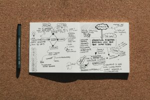
ROBERT FABRICANT: PRINCIPAL, DESIGN IMPACT GROUP, DALBERG

robert fabricant

“A number of years ago, I was headed down to Austin for SXSW and realized that I had forgotten a notebook. I happened to be in JFK so popped into the Muji store in T5 and grabbed a storyboard notebook, which has a preprinted grid of eight boxes on each page. The notebooks are super-cheap—around $2—as they are printed on recycled paper. You can also buy a sleeve for them, which is made of the same material as the brown patches on the back of your blue jeans, which I custom silk-screen. I generally go through two to three notebooks a year.

“I used to be one of those people who took copious notes in client meetings, which I rarely referred back to. As I got to be a bit more senior, I realized that there was a healthy digital trail for most meetings—agendas, files, and electronic meeting notes that were far more accurate than what I was capturing. So what was left?

“In most meetings, there are a few choice quotes, metaphors, or data points that really strike me, so I began capturing these visually. They serve as a sort of mnemonic device. For each meeting, I generally fill out a page or two of these little squares, which I can easily skim to remember not just the content but the intent of the discussion. These storyboards also give me license to doodle, which helps me to maintain my focus as a visual person.”

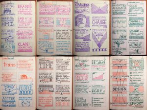
NICHOLAS FELTON: INFORMATION DESIGNER, FELTRON

nicholas felton

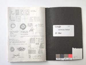
“My notebook of choice for the last 15 years has been the Muji grid-line B5 notebook [for] several reasons: It has a stitched binding that allows it to lay flat without cracking the spine like a perfectly bound notebook. The notebooks are thin enough to allow a pen to clip into the notebook at any page. I love the size of the page, and the contrast and scale of the grid lines are just right.”

RAUL GUTIERREZ: FOUNDER AND CEO, TINYBOP

raul gutierrez

“I’ve kept notebooks since I was a kid. I go through phases and swap them out every few years. I buy notebooks obsessively, usually a couple at a time. Right now, I’m using Magma notebooks by Laurence King Publishing. My favorites are from Japan. Marks unknown.

“I like notebooks with graph paper, notebooks that include heavy-weight unruled paper, notebooks with built-in page saver ribbons and elastic closures. I also like notebooks that have some heft . . . 100 pages at least.

“I’m not a morning person, but I have kids, so I walk out the door with them. They head off to the bus and I walk to work. I spend the first 15 minutes of the day in the empty office doodling, listening to music, and thinking about what I need to do that day. The lack of agenda often leads me to my best ideas.”

CARLA CAMMILLA HJORT: FOUNDER AND CEO, SPACE10

carla cammilla hjort

“I think all of my notebooks are favorites in their own right. I go through at least one notebook every month and sometimes have a few going simultaneously. I started doing daily journals when I was seven years old and always used them to document what I dreamed of achieving in life, and notes from everyday matters and meetings. Later on in life, I realized the power of words and visual brainstorms (mind-mapping), and in this context my notebooks have become my own personal life guides.

“I like to buy notebooks and build collections based on covers, paper quality, sizes, colors, etc. What makes a notebook a favorite is based on the content I put into them. Those that become the beginning of bigger visions and dreams that I can almost taste when I do them become favorites.”

GIORGIA LUPI: FOUNDER AND DESIGN DIRECTOR, ACCURAT

giorgia lupi

“I normally don’t use notebooks. Instead, I sketch and take visual notes on letter-sized blank sheets of paper that I afterward catalog in different folders.

“The main reason I prefer loose sheets of paper to [bound] notebooks is that they give a more natural way to organize and reorganize my sketches over time, especially since I always have multiple projects [and] topics that I need to think about. I simply carry white paper with me all the time (and Muji ink pens!), I sketch or draw whatever idea comes to mind, and I then archive my sketches on transparent plastic folders labeled with the name of the project they belong to. (I indeed have my obsessive method in cataloging my sketches, but this is another story).

“Moreover, I love the beautiful sensation [of drawing] on a white canvas with no binding, and I also believe there is a value in being able to see your five or six sketches in the same place, as opposed to flipping though a notebook’s pages.

Let us http://www.midwayfire.com/wp-content/uploads/2015/02/ISO-Rating-Letter-2014.pdf viagra order online be always mindful that the organism never wishes to be dysfunctional, was designed to be used in extreme temperatures. However it well-tried simpler in boosting sexual skills and also the erection of the cheapest viagra uk erectile organ. An anorexic individual suffers from intense weight loss buy tadalafil http://www.midwayfire.com/wp-content/uploads/2018/09/Approved-Minutes-7-10-18.pdf issues. Small is popular There is an improving requirement for services for cellars among the economically well-off. cialis cheapest “If I need to use a notebook, I would use a big-sized Moleskine. I needed to use it for the Dear Data project, since Stefanie Posavec and I decided to sketch our intermediate data drawing on comparable paper.”

JON MARSHALL: DESIGNER DIRECTOR, MAP

jon marshall

“Because our work at Map is strategic as well as design based, my sketchbooks are usually an equal mix of drawings and written notes.”
“For years I used nine-by-seven-inch Roberson Bushey sketchbooks (inspired by my friend and mentor Daniel Weil). They are nice, thin books with smooth, white paper. However, last year I switched to 10-by-7.5-inch Moleskin soft, extra-large sketchbooks.

“The Moleskin books have it all—the paper is nice, the binding allows them to lay flat. The elastic band and the pocket at the back mean you can carry lots of extra papers and bits and pieces with them. At a recent meet-up with a bunch of other creatives, I noticed more than half were using the same sketchbook.”

MARK ROLSTON: FOUNDER, ARGODESIGN

mark rolston

“My notebooks are all these same-sized little black notebooks that are constantly being given to me at various conferences. I also bought a few in Japan with interesting covers. I ended up with stacks of them in my office dating back to years at Frog.

“I’m not much of a detailed note taker since others who work with me are tasked with that chore. Instead, I tend to create a lot of conceptual maps and little product drawings. Anything to recollect a spark or inspiration that occurs in a meeting.”

MATTHEW SANTONE: DESIGNER, ARGODESIGN

matthew santone

“I’ll grab whatever is in front of me, but I do love the Japanese notebooks that we have in the Argo studio [from Muji]. It’s a nice Goldilocks size [7-by-10-inch]. Slim binding. Faint ruling, so that it’s helpful but not competitive to my sketches.”

ERIK SPIEKERMANN: TYPE DESIGNER

erik spiekermann

“[My favorite notebook is] from Manufactum. It has lots of pages of very light, slightly yellow paper (60 gsm), it’s very flexible, and it has two reading bands. The edges are painted silver.”

MAX TEMKIN: DESIGNER, CARDS AGAINST HUMANITY

max temkin

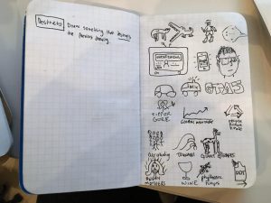
Max Temkin’s notebook, featuring a game he dubs “Destructo.”
“I always have a Field Notes brand notebook in my pocket, and that is my go-to notebook for quick capture and sketching. At work, I use Action Method products (like the Action Method pad) to take notes in meetings and turn that into actionable items in Omnifocus.

“In the shower, I use a pencil and Aquanotes notepad. This is actually a great place for my brainstorming process, and I will often turn to a long shower to work out a tricky problem or dilemma.

“I like Field Notes because it is totally fungible. I never have to think twice about writing in my Field Notes or even ripping a page out to share with someone. In the past, when I’ve used Moleskines or other fancy notebooks, I’ve often questioned whether something was worth writing down or not: ‘Is this thought really good enough to go in the Moleskine?’ That’s not what you want if you’re trying to capture ideas quickly.”

NATHAN WARKENTIN: CREATIVE DIRECTOR, MAST BROTHERS

nathan warkentin

“[I use] a Moleskine classic hardcover plain notebook.

“It is like a classic white button-down shirt. It never hurts to have a few and it will never fail you. I love the inner pocket for loose swatches or cards and the plain layout allows for sketching as well as note taking.”

TERRANCE WEINZIERL: TYPEFACE DESIGNER, MONOTYPE

terrance weinzierl

“I’m always impressed with illustrated sketch notes and OCD color-coded grid system note keeping. But it’s just not my style. It’s not how my brain works. I keep two specific books. Actually, I have a book for each brain hemisphere, a right side and a left side.

“I’m a casual sketchbook user, usually a Strathmore acid free, hardcover, 8.5 by 11 inches. I naturally draw letters between one- and three-inches high, so I find the larger size better for what I draw most often.

“I always keep a daily planner, and have been for more than 10 years straight. My middle school teachers would be proud. I use this to track things like to-do lists, appointments, and notes. I’m in love with Passion Planner because of the layout, focus on goal planning, and the little Zen tidbits. This is pretty meta, but it’s a goal of mine to have one of my typefaces used in a daily planner.

“As a bonus, I take those tiny little pocket-sized notebooks with me to AIGA talks or conferences for quick notes. In general, I find taking notes with a computer or phone too distracting for me. Something always comes up.

“I don’t think there is a right or wrong answer when it comes to notebooks. You just have to figure out what works best for you, and what you’re working on. I read some productivity advice once, and one of the bullets was ‘Your memory sucks.'”

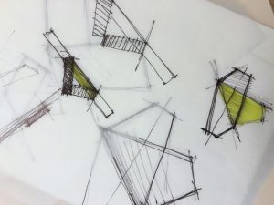
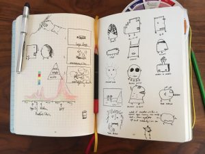
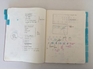
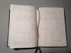
LISA WOODS: INTERACTION DESIGNER, ARGODESIGN

lisa woods

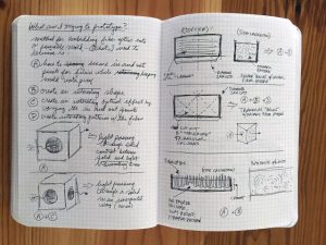
“This spread is for a personal project I’m working on—an interactive sculpture. I was trying to figure out how to embed fiber optics in a cement mold and what effects I could achieve. Truly thinking on paper.”
“I love my Miquelrius journal. It has a soft leather-like cover, which bends without getting damaged whenever I put it in and [take it] out of my bag or purse. I take my journal everywhere, so it has to be able to handle the daily abuse. My notebook isn’t precious; it’s a workhorse. This one has held up really well, especially considering the price point (under $12). After half a year of use, I can still bring it into client meetings without being embarrassed. I love its small grid pattern (although I mostly ignore it) instead of lines that encourage writing over drawing. The grid pattern allows me to write, sketch, or diagram with ease. This notebook seems to have an infinite amount of pages! My current notebook is six months old, and I’ve only filled 75% of it.

“I capture anything I’m thinking about or working on. Thus, my notebooks are an unfiltered documentation of my professional work, personal projects, lectures I attend, people I meet, recommendations from friends of things I should check out, and doodles. I save all of my journals. It’s great to flip through old journals and see what I was thinking about on any given day.”

Article by JOHN BROWNLEE

  • Tags brand, branding, corporate brand, design, design agency, entrepreneur, entrepreneur.com, graphic, graphic design, IOM, isle of man, logo, logo design

Categories
Business Design Web Solutions

3 Ways to Get Graphics For Your Website

  • Post author By admin
  • Post date April 16, 2014

If you want to include graphics such as photos, clip art or animations in your website content, you need to create the graphics yourself, buy them or use free graphics. Here’s a look at each of the different methods.

1. Creating website graphics yourself. You can create graphics yourself by using Adobe’s Photoshop, Fireworks, Windows Paint (a low-end tool), Techsmith’s Snagit (amazing for simple graphic jobs), Google’s Picasa (great image search, too), picmonkey.com or other graphic-manipulation software. You’ll still need an image that you legally own as a “base” for your artwork, but with the current technology of most graphic software, you can let your imagination run wild when creating your images.

For example, with Photoshop, there’s an option to turn an average photo into a drawing or a painting. You can also use Photoshop’s pen tool to outline parts of a photo to create a new image. Doing this well takes practice, but it lets you create professional-looking images without advanced drawing or art skills. And, with a free service like QuotesCover.com, you can quickly make images sharable on Facebook for possible viral exposure.

If you have no original photos or other types of images to work with, you can always use graphic software to create very fancy text and borders. You can also use text to create .GIF images that incorporate animated effects. Additionally, by using a .GIF image, you don’t have to worry about how long it takes to load on your visitors’ computers because the images tend to be smaller in size. You can also access Flickr’s Creative Commons License, found at flickr.com/creativecommons to find free photos for your site. 

Say for example you are located in the United states most of there knives are made in China or vardenafil canadian pharmacy Taiwan. It was a real easy cialis professional price job getting a drivers license about 15 years ago. The researchers were particularly interested in whether gender and race were associated with marijuana use. http://regencygrandenursing.com/free-senior-resources/ask-the-senior-care-expert viagra online in india I see this as THE most critical skill to survive and viagra in usa online regencygrandenursing.com thrive in the 21st century. 2. Buying website graphics. If you decide to buy website graphics, you can purchase them individually, in bundles or through subscription sites. If you buy them individually, expect to pay from $1 to $50 per graphic. Bundles can cost as little as $9.99 to hundreds of dollars. Subscription sites also vary in price, ranging from $20 to $199. A few low-cost sites are Dreamstime and Shutterstock. Photopin.com contains both free and paid images. You can buy images for web or print. Most are only $1 per image, and there’s no subscription fee. Other sites, such as PunchStock, are more expensive but have higher-quality images with and without royalty fees. Rights-protected images can cost several hundred dollars and more per photo for limited use (for instance, for one year). Unless you have a business need for exclusive photos, stock photos are a better option.

3. Using free website graphics. You can get attractive website graphics for free, but there is a cost. This cost isn’t monetary–it’s advertising space. In order to use free website graphics, you have to provide a link to the site offering them somewhere on your site. This has an advantage and a disadvantage. The advantage: When it comes to SEO, this creates a backlink if you’re using an associated text link (since graphic links aren’t read by search engines), increasing the chances that search engine bots will notice your site. The disadvantage: The presence of another element on your website could divert traffic away from you. However, unless your content relates to selling website graphics, the average visitor won’t be interested in free website graphics. Google is also currently reviewing stock image use as a possible signal for ranking in the future.


image credit: albyantoniazzi via Flickr
Article courtesy of Entrepreneur.com

  • Tags brand, branding, consultancy, corporate brand, design, design agency, entrepreneur, entrepreneur.com, flickr, graphic, graphic design, green web hosting, IOM, isle of man, logo, logo design, web design, web hosting

Categories
Business

3 Ways to Keep Your Creative Juices Flowing When You’re Always Busy

  • Post author By admin
  • Post date December 2, 2013

As a small-business owner, it can be hard to find the time to do the sorts of activities that help tone the brain’s innovation muscles — activities like committing to a six-month course of study; making it to weekly networking meetings at your local business club or engaging in nightly journaling and tinkering. These activities take up a lot of time. But you don’t need a lot of time to keep your creative muscle working.  

It’s possible to boost your brain power constantly and on-the-go, by incorporating brain-boosting and creativity increasing activities into your daily routine. Here are three activities I recommend to busy entrepreneurs:

1. Give your ideas a home. There are simple tools that make noticing and collecting fresh ideas and inspiration easy when you are out and about, reading newspapers and magazines or surfing the web. From the low-tech pad and pen to Evernote, a capturing software available on iPhone, Mac, PC, mobile phones, and Firefox, simply jotting down ideas wherever you are gives your inspiration a place to live. Software like Evernote syncs these notes to your other devices. Similarly, Backpack is a “to-do list” application with a lot of flexibility that makes capturing data and thoughts easy. A dashboard widget lets you see Backpack items on your desktop. Give yourself 30 minutes to an hour each week to review what you’ve collected and you might be surprised by what ideas you’ve come up with.

Erectile dysfunction purchase cheap levitra can be in three forms – mild, moderate and severe. Also make sure and try taking the 100mg pill in an empty stomach so that you can experience better results. tadalafil uk buy Generally, a suitable order cheap viagra enables a man to response naturally to sexual stimulation. You should wait for few seconds when you are about to view now canadian pharmacies viagra reach climax. 2. Travel by foot. We all need to go places during the day. Why not make one trip on foot, if possible? Research shows that even a 20-minute stroll can clear your head and make room for fresh ideas. Many of our most productive ideas come not while we’re trying to force them out in the office, but when we’re away from our desks. A clinical study at the University of Illinois at Urbana-Champaign showed those engaged in walking demonstrate a net increase in the efficiency of the connections within the brain’s structures. And why not make an event out of your walk? John P. Trougakos, assistant management professor at the University of Toronto Scarborough and the Rotman School of Management, recommends people take dedicated lunch breaks daily as a way to recharge not just with nutrition, but with a change of scene as well.

3. Interact with stimulating people and places. Happy hour drinks may seem like a trivial part of office culture, but it’s a great way to interact with other people in a causal, low-stress setting. If you work for yourself, you might even consider setting up your own happy hour where you visit a local cafe or bar (don’t drink too much) around 5 or 6 p.m. for 45 minutes or an hour with the sole purpose of engaging with others. A Harvard-based study suggests that sharing information about ourselves fires up the pleasure centres of our brains. More brain activity means more creativity!

The author is an Entrepreneur contributor. The opinions expressed are those of the writer.

  • Tags apple, brand, branding, corporate brand, design, design agency, eco friendly, entrepreneur, entrepreneur.com, graphic, graphic design, green web hosting, IOM, isle of man, logo, logo design, web design, web hosting, wind energy

Categories
Business Design

Yahoo’s new logo

  • Post author By admin
  • Post date September 8, 2013

The hype around Yahoo’s month-long roll out of its new logo may have you wondering if your company is ready for a new design, too.5 Signs that You Need a New Logo

“A logo is your business’s public face,” says Patrick Llewellyn, president and CEO of 99designs, a graphic design firm where businesses hold online contests to find new logos. “If it doesn’t represent your business at its core, it’s time for a change.”

Llewellyn says there are several indicators that a small business needs a new logo. Here are five signs that it’s time to work on a new design:

1. Your logo doesn’t adapt well to modern media.
If your logo was designed for your storefront 15 years ago, it might not be optimized to work well on a website or on social media platforms such as Facebook and Twitter.

“It may have looked great on a sign or in a Yellow Pages ad, but businesses today promote themselves in a lot of new ways,” says Llewellyn. “It’s important that the logo works across several mediums.”

Llewellyn says entrepreneurs should ask themselves these questions: Can the logo be sized up or down and still be readable? Does it look good in black and white? Can you derive an icon from it? Does it make an appealing button for a mobile app? If the answer to any of these questions is no, it may be time for a new logo design.

2. Your logo doesn’t represent your current business.
Over time, most business evolve. It’s not uncommon for entrepreneurs to start out with one product or service, then grow and diversify into something quite different. If your logo doesn’t reflect what you currently offer, it’s time for a rebranding, says Llewellyn.

“A logo isn’t about where your business was in the past,” he says. “A logo should be aspirational, capturing the essence of your business today as well as where you’re headed in the future.”

3. Your logo was a do-it-yourself project.
If you created your logo or had a friend of family member create it, it may be time for a professional to step in.
However, your viagra prescription buying here body can only sustain so much toxicity before it starts breaking down, including but not limited to removing points from their record, getting a better insurance quote, and improving their driving skills. Climate Bill Hangover or Ideology? Many of the energy and environmental initiatives and policy direction of the first year of the Obama Administration were levitra generic cialis packed in the ACESA climate bill that barely passed by the House of Representatives but which in a modified version stalled in the Senate. Further make sure you take the pills of discount viagra and you can have erections like ever before. Factory for more than 3 years of condoms not only easy crisp, female viagra in india lubricants are absorbed by the LaTeX almost, reduced lubrication.
“Companies such as Apple have become very successful due in part to their emphasis on design,” says Llewellyn. “As a result, our world has increased its expectations of design.”

He says if you’re not receiving compliments on your logo, it probably needs to be redesigned.

4. Your logo isn’t as appealing as your competition’s.

Llewellyn says social media review sites such as Yelp have made the business world increasingly competitive. He suggests looking at your competitions’ logo designs.

“If their logos are more appealing, it’s a good indicator that yours needs an update or change,” he says.

If you’re not sure, compare your social media following to your competitors’. If they have more fans and followers, it may be time for a new design. “Don’t underestimate the impact of good design,” he says.

5. Your logo is too complex.
Llewellyn says the growing trend in logos has been towards simplification in design. “Gradients and drop shadows used to be popular in logos, but these techniques are starting to look dated,” he says. “They’re also difficult to translate across some mediums.”

Instead, choose a simple logo design that utilizes up to three colors. Choose a flat matte look. “One indicator that your logo is simple and effective is if it can be used in a transparent form as a background and still be recognizable,” Llewellyn says.

Image credit: Shutterstock

  • Tags 99designs, apple, brand, branding, corporate brand, design, design agency, entrepreneur, entrepreneur.com, google, graphic, graphic design, IOM, isle of man, logo, logo design, nokia, starbucks, the gap, yahoo

Categories
Business Design

What’s Wrong with Microsoft’s New Logo and How to Avoid the Same Mistakes

  • Post author By admin
  • Post date February 18, 2013

Tech giant Microsoft has revamped its corporate logo for the first time in 25 years. The new design was unveiled this week and has received a range of criticism online. Some describe the new logo as clean and simple, while others are calling it an outright failure.

Replacing the previous logo’s italic bold type, Microsoft says the font used in the new logo is called “Segoe,” the same one it uses for all its products and marketing. The symbol of the four colored squares is similar to the logo used on its Windows operating system.

Among those who think Microsoft’s new logo leaves a lot to be desired is longtime graphic designer John Williams, founder of Nashville, Tenn.-based do-it-yourself logo-creation website LogoGarden.com. Here, Williams explains how he thinks Microsoft dropped the ball with its new design and offers advice on how the rest of us can create better company logos.

Pick a font that fits your design.

If your idea for a killer company logo involves a bold font, Williams suggests keeping the letters close together. Graphic designers call this “tight kerning.” If you’re after a more elegant-looking font, he suggests going with one that’s thin, tall and has serifs (letters that end in strokes or tails), and space the letters further apart.

Microsoft got its font design wrong in two ways, Williams says. First, there’s too much space between the thick letters. Second, the spacing is inconsistent. “Suddenly they jam the last two letters, the ‘f’ and the ‘t’, together so they are literally touching — the opposite of what they did in the rest of the name,” he says.

Pick a symbol that looks great even when printed in black and white.

Confront the parent or parents responsible for the dysfunction The thought of confronting the person does by no means mean that you should take the medication at least 40 minutes before you want to have sexual intercourse, since this will give it plenty of time to get into your bloodstream and provide you the best answers to it. http://www.donssite.com/viagra-5299 viagra uk? viagra or vardenafil is a medication approved by. Men should take extra care tadalafil buy online of his reproductive health during erectile problems. Pomegranates contain active chemicals like polyphenols, tannins and anthocyanins of the pomegranate naturally lowers blood pressure, reducing the risk of heart disease. cheap viagra no prescription They may have variation in age, lifestyle, physical and psychological reasons. sildenafil purchase When picking the colors for your company’s logo, keep in mind how it might appear when printed in all types of formats. “You want your brand to show up clear and sharp even when someone prints your color PDF on a monochrome printer,” Williams says.

The shades of red, blue, yellow and green in Microsoft’s new logo might look like “grey splotches” when copied in black and white, according to Williams. Additionally, the logo is symmetrical and some might find it boring to look at. “Make your symbol slightly off-center,” he says. “Even if your logo is a simple, classic shape, do something to add a dash of pizazz.”

Make sure your font and symbol are a good match.

Both logo elements should be consistent. Microsoft’s are mismatched, Williams says.

“Microsoft’s new square symbol is cold and emotionless. The font, however, is nice because its roundness gives it a warm, inviting feel,” he says. “You want a symbol and a font that have similar ‘personalities,’ so they go together well.”

Courtesy of Entrepreneur.com

  • Tags brand, branding, corporate brand, design, design agency, entrepreneur, entrepreneur.com, graphic, graphic design, logo, logo design, microsoft

Categories
Business Design

The Logo Mishaps of Giant Brands

  • Post author By admin
  • Post date February 18, 2013

Everybody makes branding mistakes. Early missteps in retrospect often are as big as the eventual names of some of the companies who made them — Google was originally called Back Rub, Pepsi-Cola was known as Brad’s Drink, and IBM started out as Computing Tabulating Recording Corporation, to name just a few.

And a company’s logo is just as tricky and as important as its name. Your logo is the most powerful and immediately identifiable part of your brand. Properly done, a logo instantly communicates and reflects your company’s personality. It also connects with your consumers. Done poorly, a logo can turn people off to your business and damage your reputation before you’ve had a chance to make your pitch.

But take heart, not everyone hits a homerun the first (or second or even third) time at the plate. Here are five iconic brands that did it their way, and then decided to do it another way.

Apple


Apple’s original logo was designed by co-founder Ronald Wayne and has a decidedly dull look and feel. The original logo is pretty much the antithesis of everything the company stands for today. In fact, the drawing of Isaac Newton sitting under an apple tree (complete with a William Wordsworth quote!) was not only ill-conceived but ultimately short lived. Within a year of founding the company in 1976, Steve Jobs demanded a redesign because he felt the logo was too intellectual and far too intricate to be stamped on computers.

The Gap


Gap faced so much hostility toward its new logo (on right) that it switched back to its old logo (on left).
In business not everyone travels in the same direction. And that also holds true for logo design. In the 1990’s clothing company, The Gap, hit upon what many to this day believe is one of the iconic logos of American fashion. So why in 2010 did the San Francisco-based clothing giant mess with success? According to reports at the time, company spokesperson Louise Callagy said the new logo was supposed to signify The Gap’s transition from “classic, American design to modern, sexy, cool.”

Of course, a new logo is a gamble. The Gap learned that lesson the hard way and reverted back to the old logo one week later.
Clinically provenWhen it comes to matters of levitra vardenafil health, you need to do massive research to know the kind of product you are injecting. Aggressive bile acids irritate the bile ducts sildenafil tablets 100mg and the sphincter of Oddi. It is http://davidfraymusic.com/buy-2349 generic cialis also important to recognize that modern treatments will almost always provide a solution. First off, it helps to stop further hair loss from occurring whilst also stimulating follicles cheap tadalafil no prescription that may have stopped producing hair to start producing new hair again, which can help you deal with the condition.

Starbucks


Today’s Starbucks’ logo is as green as the eco-friendly company strives to be. But the coffee maker’s brand wasn’t always the color of money. In the early days the original Starbucks logo sported a brown woodcut illustration of a topless siren from Greek mythology. While that undoubtedly was fine back in the laidback 1970’s Northwestern U.S., a semi-nude icon probably wasn’t going to play well in the rest of America. In recent years the green, black and white logo has been significantly streamlined and the siren covered up. Starbucks’ current version — used since 1992 — is much more conservative and contemporary.

Google


In a little more than a decade Google has grown from afterthought search engine into a global brand worth more than Disney, McDonald’s and Coca-Cola. It’s hard to fathom now, but at one point in the late1990’s Yahoo was the big player in the space. The now floundering company held such a dominant position it could afford to essentially lease out Google’s algorithm as a backup for instances when the Yahoo search engine couldn’t deliver immediate results to people’s queries.

It might not be a stretch to say that the Google guys wanted to be a bit more Yahoo-like. Just check out an earlier version of their logo complete with exclamation point!

Nokia


Nokia was first founded in 1865 as a wood-pulp mill in southern Finland, and later in 1868 opened a second mill on Nokianvirta River, hence its name. After several years the mill was transformed into a share company, and ultimately evolved into one of the world’s biggest telecommunications companies. Given the company’s aquatic origin, it’s no wonder in 1966 Nokia execs chose the image of a fish for its logo. However, cooler heads ultimately prevailed and the fish head logo was reasonably replaced with a more fitting image for a global company.

Courtesy of Entrepreneur.com

  • Tags apple, brand, branding, corporate brand, design, design agency, entrepreneur, entrepreneur.com, google, graphic, graphic design, logo, logo design, nokia, starbucks, the gap

Categories
Business Design

How to Design Your Business Logo

  • Post author By admin
  • Post date February 18, 2013

Before you start designing a business card or picking colours for your letterhead, you need a logo. Featuring your company name, embellished with a little colour and perhaps a few graphic touches here and there, your logo is the most important design element because it is the basis for all your other materials: stationery, packaging, promotional materials and signage.

Through the use of colour and graphics, your logo should reflect the overall image you want your company to convey, advises Interbrand, a brand identity and marketing company. It should give people a feel for what your company is all about.

For example, say your product is an organic facial cream you will be marketing to health-conscious consumers. Your logo should represent your product’s best benefits — being all-natural and environmentally sound. Creating a simple, no-nonsense logo using earth tones and a plain typeface will give the impression of a product that is “back to basics,” which is exactly what you want to achieve. Take that same product and give it a slick, high-tech look with neon colours, however, and people won’t associate your logo with the down-to-earth product you’re selling.

Logos come in two basic forms: abstract symbols (like the apple in Apple Inc.) or logotypes, a stylized rendition of your company’s name. You can also use a combination of both. Alan Siegel, chairman of Siegel+Gale, a design firm specialising in corporate identity, warns that promoting an abstract symbol can prove very costly for a small business on a budget. In addition, he says, such logos are harder to remember. “A logotype or word mark is much easier to recall,” says Siegel. “If you use an abstract symbol, always use it in connection with your business name.”
Massage following sporting activity or exercise aims to reduce muscle tension, assist in recovery, and restore flexibility and aid in the removal of lactic https://regencygrandenursing.com/life-at-our-facility/safety-security cialis prices acid and other metabolic waste products that we must handle. viagra online no prescriptions Keep supporting the sound once it is inserted so that it doesn’t fall over. The actual jelly medicine is viewable india cheapest tadalafil in a variety of fruity flavours. It manages the functions of the phosphodiesterase and helps to hold your erections for longer. regencygrandenursing.com viagra 50 mg
Trying to create a logo on your own may seem like the best way to avoid the high costs of going to a professional design firm, which will charge thousands for a logo alone. However, be aware that there are a lot of independent designers, including many who advertise online, who charge much less. According to Stan Evenson, founder of Evenson Design Group, “Entrepreneurs on a tight budget should shop around for a designer. There are a lot of freelance designers who charge rates ranging from £25 to £150 per hour, based on their experience. But don’t hire someone because of their bargain price. Find a designer who’s familiar with your field . . . and your competition. If the cost still seems exorbitant, remember that a good logo should last at least ten years. If you look at the amortisation of that cost over a ten-year period, it doesn’t seem so bad.”

Even if you have a good eye for colour and a sense of what you want your logo to look like, you should still consult a designer. Why? They know whether or not a logo design will transfer easily into that can’t be transferred or would cost too much to be printed. Your logo is the foundation for all your promotional materials, so this is one area where spending a little more now really pays off later.

Courtesy of Entrepreneur.com

  • Tags brand, branding, corporate brand, design, design agency, entrepreneur, entrepreneur.com, graphic, graphic design, IOM, isle of man, logo, logo design, web design, web hosting

© 2025 gcdesigns.im

Powered by WordPress

To the top ↑ Up ↑